World Hospital Dashboard
Transforming Complex Healthcare Data into Actionable Insights

Client
Purehealth
Type
Web App, Dashboard
Industry
Healthcare
Role
UI/UX Designer. Researcher, Architect
Introduction
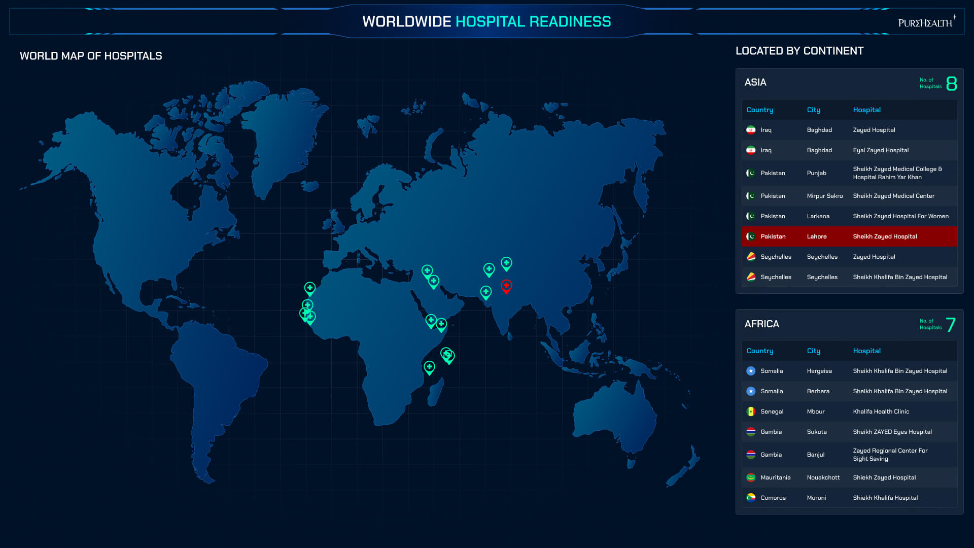
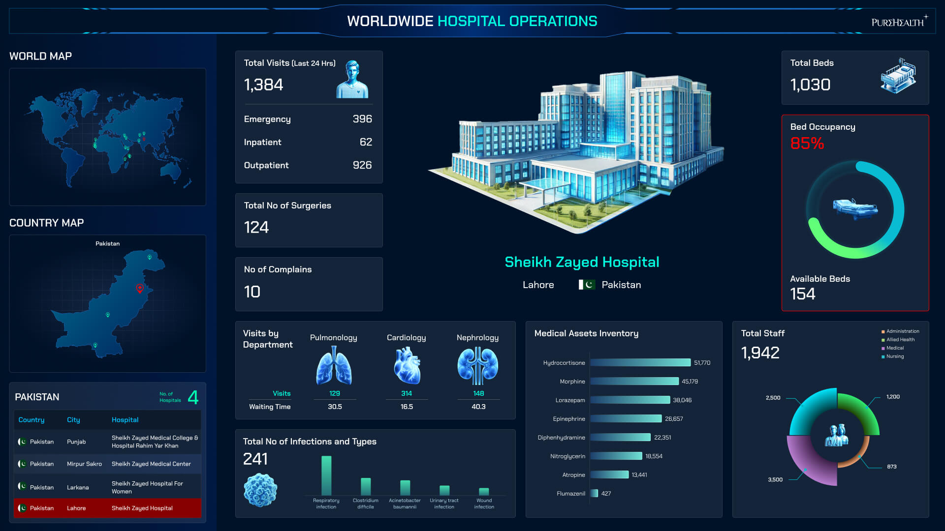
The World Hospital Dashboard is a large-scale healthcare analytics platform developed for PureHealth, designed to support strategic, operational, and clinical decision-making across hospital environments. In this project, I worked as a UI/UX Designer, focusing on transforming complex medical and operational data into clear, accessible, and actionable visual insights. The dashboard was built to serve multiple stakeholders—from executives and administrators to operational teams—ensuring critical information can be understood quickly, accurately, and confidently in high-pressure healthcare settings.
Technologies

Project Description
PureHealth required a robust, scalable dashboard capable of consolidating large volumes of hospital data into a single, unified view. The primary challenge was presenting complex metrics—such as performance indicators, operational efficiency, resource utilization, and clinical outcomes—without overwhelming users. My role covered UX strategy, information architecture, data visualization design, and UI execution, ensuring clarity, consistency, and usability throughout the system.
I began by defining user roles and decision-making needs, structuring the dashboard around priority KPIs and real-world hospital workflows. UX methods such as stakeholder mapping, dashboard hierarchy planning, and usability-driven layout design guided the experience. Clear visual hierarchy, intuitive navigation, and standardized components help users interpret data quickly and reduce cognitive load, which is critical in healthcare environments.
The interface design follows modern healthcare dashboard principles—clean layouts, restrained color usage, and high-contrast data visualization—to support readability and accessibility. Design trends such as modular layouts, scalable card systems, and contextual drill-downs were applied to ensure flexibility across departments and future expansion.
What differentiates this dashboard is its balance between clinical precision and executive-level clarity. Rather than simply displaying data, the design enables insight-driven conversations, faster decision-making, and improved operational awareness—supporting PureHealth’s broader mission to elevate healthcare delivery through intelligent, data-informed systems.