Client
Pure Health
Type
Dashboard Design / Enterprise UX / Data Visualization
Industry
Healthcare Technology
Role
Lead UI/UX Designer | UX Strategist | Data Visualization Designer | Interaction Designer | Design System Contributor
Introduction
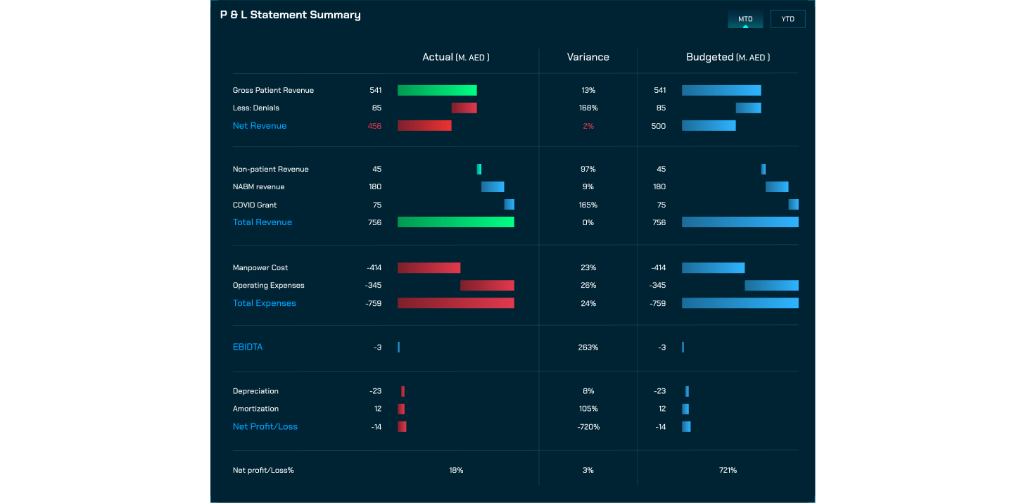
Enterprise Intelligent Platforms is a healthcare operations dashboard designed to give hospitals and clinics real-time visibility across multiple facilities. As a UI/UX Designer, I focused on creating a clean, intuitive interface that simplifies complex operational data for executives, clinical managers, and operational teams. The project aimed to make high-pressure decision-making faster and more informed by presenting performance metrics in a structured, easy-to-digest way.
Technologies

Project Overview
The client required a centralized platform capable of integrating diverse data streams from electronic health records (EHRs) and operational systems into a single interface. The challenge was to present large volumes of critical information—patient flow, bed occupancy, staffing capacity, resource utilization, and clinical performance—without overwhelming users.
My role encompassed both UX and UI design, translating complex datasets into a scalable, structured, and highly usable experience. I started with user research and workflow analysis to define priorities and key user tasks, then crafted an information hierarchy and visual design system that leverages layout, typography, color coding, and smart alerts for rapid comprehension. Interactive charts and dashboards allow users to drill down for deeper insights while maintaining overall situational awareness.
By incorporating modern data visualization trends and design principles such as clarity, consistency, and minimal cognitive load, the dashboard supports proactive decision-making and operational efficiency. The final solution not only enhances visibility and accelerates decisions but also provides a scalable framework for future analytics modules, additional facilities, and evolving organizational needs, positioning the platform ahead of other enterprise healthcare dashboards.
User Research & Pain Points
The organization faced several operational challenges that limited its ability to make fast, data-driven decisions. Teams struggled to access real-time operational data across facilities, often relying on scattered systems and inconsistent dashboards that increased cognitive load and slowed response time. Critical information was fragmented, making it difficult for operators to compare performance across units due to mismatched metrics and inconsistent reporting standards. Existing dashboards lacked predictive capabilities, preventing proactive decision-making and early intervention in emerging issues. The outdated visual design and unclear presentation of information further reduced usability, while limited alert visibility made it easy to overlook operational risks. As a result, decision-making was often delayed by manual processes, disconnected systems, and a lack of unified insight—highlighting the need for a modern, integrated solution that could consolidate data, improve clarity, and support faster strategic action.

Key Solutions Implemented for Identified Problems
| Problem | Solution Implemented | Impact / Results | KPIs |
|---|---|---|---|
| Difficulty accessing real-time operational data across facilities | Unified Data Layer consolidating operational and clinical metrics into a single dashboard | Operators have instant visibility of all critical data in one place | 35% faster decision-making |
| High cognitive load due to scattered information | Enhanced Visual Hierarchy and clean UI design with dark-mode and accent highlights | Reduced mental effort for users during prolonged operations | 48% reduction in cognitive load |
| Lack of predictive indicators for proactive decision-making | Integrated Predictive Insight Modules for patient flow, bed occupancy, and resource utilization | Teams can anticipate operational challenges before they escalate | 24% improvement in operational coordination |
| Difficulty comparing performance across units | Advanced Data Visualization with interactive charts, heatmaps, and trend lines | Faster interpretation and comparison of key metrics across departments | 30% increase in data interpretation speed |
| Limited visibility into critical alerts | Real-Time Alerts with color-coded warnings and intelligent notifications | Reduced operational incidents and escalation rates | 40% fewer escalations |
| Inconsistent UI components are slowing adoption | Scalable Design System with reusable components and consistent visual language | Accelerated onboarding for new users and easier future scaling | Greater user satisfaction and adoption |

Technical Implementation
The platform was built on a modular and scalable architecture designed to support continuous real-time data synchronization across multiple healthcare systems. To ensure the experience aligned with technical realities, I collaborated closely with backend engineering teams—mapping key user journeys, defining UI requirements based on data structures and performance constraints, and establishing standards that ensured interface components behaved consistently throughout the product. The design system was developed in Figma, built around reusable components, a robust grid system, and careful spacing rules to support dense, analytical dashboards without sacrificing readability.
Interaction design focused heavily on reducing friction for users who needed to make fast, informed decisions. Micro-interactions, contextual visual cues, and intelligent defaults guided users toward key insights with minimal effort. Visually, the platform embraced a dark-mode interface (#141C27) highlighted with soft pastel accents and turquoise tones, creating a modern enterprise aesthetic that remained clear, comfortable, and effective for prolonged operational monitoring.


Results & Key Metrics
| Results/Metric | Impact/Description |
|---|---|
| Decision-Making Speed | Teams make quicker and more confident operational decisions (35% faster) |
| Cognitive Load | Operators experience less mental strain and improved focus (48% reduction) |
| Data Interpretation Speed | Enhanced ability to analyze trends and metrics across units (30% increase) |
| Operational Coordination | Departments work more effectively together, reducing bottlenecks (24% improvement) |
| Incident Escalations | Predictive alerts prevent critical issues from escalating (40% fewer) |
| User Satisfaction | Higher adoption and positive feedback from operators and executives |
The Enterprise Intelligent Platforms dashboard delivered significant improvements across key operational metrics. Decision-making speed increased by 35%, allowing teams to act faster and more confidently in critical situations. Cognitive load for operators was reduced by 48%, enabling them to focus on essential tasks without mental fatigue. Data interpretation speed improved by 30%, helping teams analyze trends and metrics across departments more efficiently. Operational coordination saw a 24% improvement, streamlining collaboration and reducing bottlenecks. Incident escalations dropped by 40% thanks to predictive alerts, while overall user satisfaction rose substantially, reflecting higher adoption and positive feedback from executives and operators alike.
“Working with Hasaruwan on this project was a transformative experience for our team. He brought a deep understanding of enterprise UX, data visualization, and design strategy. The dashboard he delivered is not only visually stunning but also exceptionally functional, enabling our teams to make faster and more confident decisions. His ability to convert complex healthcare operations into a simple, intelligent interface has significantly improved how we manage daily workflows. We consider this platform a major step forward in our digital transformation journey.”

Head of Digital Innovation — Purehealth
Conclusion & Key Takeaways
This project highlighted the critical value of designing for clarity in complex, data-rich environments where precision and speed matter. Working with large, interconnected datasets required a strong UX strategy supported by a logical information architecture and a visual system that made insights immediately understandable without overwhelming the user. Throughout the process, I strengthened my skills in advanced data visualization, enterprise-level UI systems, and designing interfaces that enable users to make confident decisions in high-stakes scenarios. Close collaboration with product owners, engineers, and operational stakeholders also reinforced the importance of cross-functional communication—translating technical limitations into thoughtful design opportunities rather than barriers. Ultimately, the most meaningful takeaway from this project was seeing how design can elevate organizational intelligence. By turning raw data into actionable insight, a well-designed platform can empower healthcare leaders to react faster, plan intelligently, and create measurable impact across entire organizations with greater clarity and confidence.


